
The day I submitted the application, I remember it was evening.
The sun hadn't set yet; golden light spread diagonally across the desk. I pasted in the site-verification code, filled in the website, double-checked the URL, and clicked "submit." My heart was settled, even a little proud. A stock site built over half a year — four thousand-plus images, thirty original articles, a tools site and a games site up and running too — how could AdSense not approve this?
I leaned back in my chair, certain it was done.
To be honest, the site started by accident. At first I was just collecting material for myself; the images piled up, my hard drive ran out of room, so I threw up a website and sorted my collection, my AI generations, and friends' uploads into categories. To my surprise, people started visiting, some even leaving comments like "been looking for this kind of image for a while." That nudged me: maybe make it a real stock site. So I started maintaining it properly — organizing images daily, writing categories, adding descriptions, publishing articles about images. Gradually it gained a bit of traffic, and I started thinking about "putting ads on it." Looking back, my understanding of "ads" back then was embarrassingly naive — I thought traffic alone made ads a done deal.
The waiting days, I refreshed the dashboard every day, like waiting for a report card as a kid, like waiting for a letter that might never come. Nothing the first day. Nothing the second. On the third morning, I opened my email with a bowl of porridge, and saw the line — the porridge nearly flew onto the keyboard.
"We're unable to approve your application at this time."
Rejected.
Further down, the reason was one sentence: low value content. That was all. No explanation, no checklist, no "here's what to fix." Four words that left me staring at the screen all afternoon. I even wondered if I'd clicked the wrong link, refreshed twice — the email was still the same, the wording still the same, cold, polite, airtight.
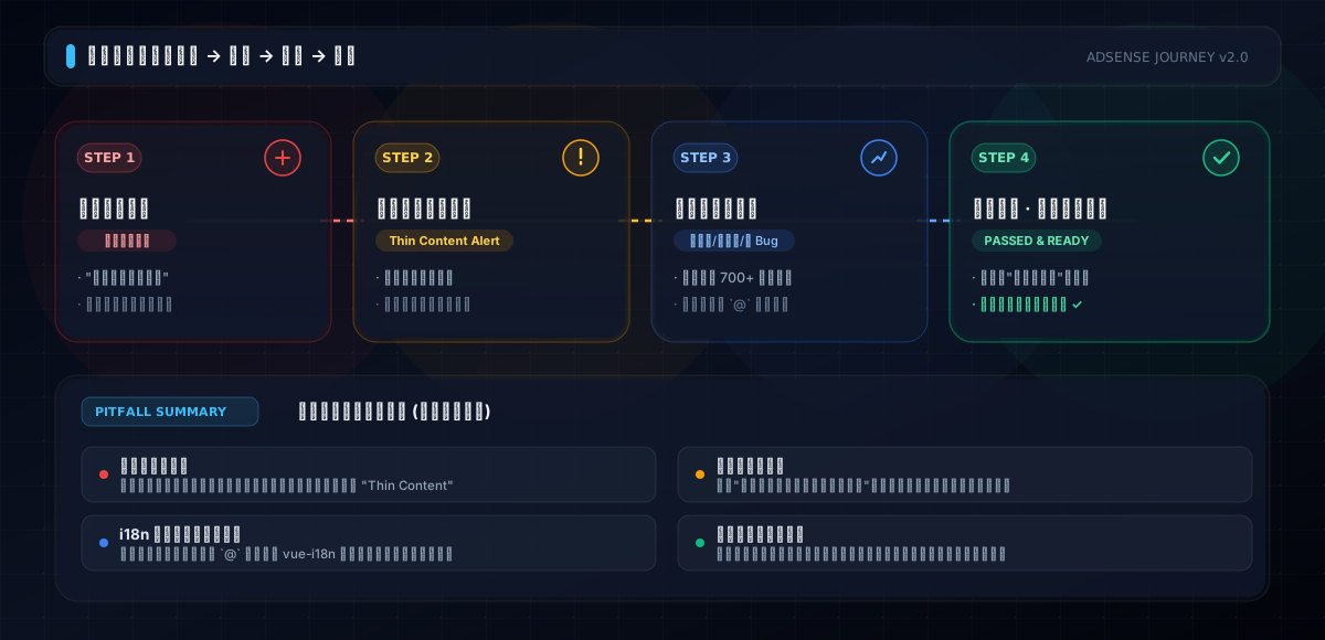
My first thought was grievance. Four thousand images, each one processed, categorized, compressed by my own hands — how is that "low value"? But after the grievance faded, I calmed down and started doing something I'd always put off: walking through my own site from top to bottom, as a complete stranger.
That night I walked until past midnight. The further I went, the hotter my face got.
I clicked into a landscape image's detail page — the photo was genuinely nice, but besides the image, there was just a title and nothing below, not a single sentence. I clicked another. Same. Another. Still the same. Out of curiosity, I went through the public images and listed the ones without descriptions — when the number jumped out, I froze: seven hundred-plus.
Seven hundred-plus pages of "image only, no words." In a reviewer's eyes, that's seven hundred empty shells. Where are they supposed to put ads? Pages with no text for people to read — every ad dollar has no reason to be there.
That's the first layer of "low value content": it's not that your images are bad, it's that your pages have no content. Stock sites fall into this trap the easiest. We always think "the image IS the content." But search engines and reviewers don't. They crawl an image tag with nothing around it. However beautiful the image, to them it's the same as a blank page. You built an "image library," but the reviewer looks at a "website." A website without words is a bookstore with shelves but no spines.
So the first fix was giving those seven hundred-plus images descriptions. Coincidentally, I had an image-captioning API on hand — give it an image, it returns a title, category, tags, and an original description. I packed the image URLs and ran them sixteen-way concurrent. That night I watched the logs, line after line of "success" rolling past — eighty-something seconds, seven hundred and two images, all with complete content. Under a hundred seconds, seven hundred empty shells became seven hundred living pages.
Of course, machine-generated content can't be used as-is. I spot-checked a few dozen — most were accurate, some went off the rails: a dog called a wolf, night described as dusk, one screenshot dressed up as "scenic." I fixed those one by one, like dusting a roomful of furniture — one piece at a time.
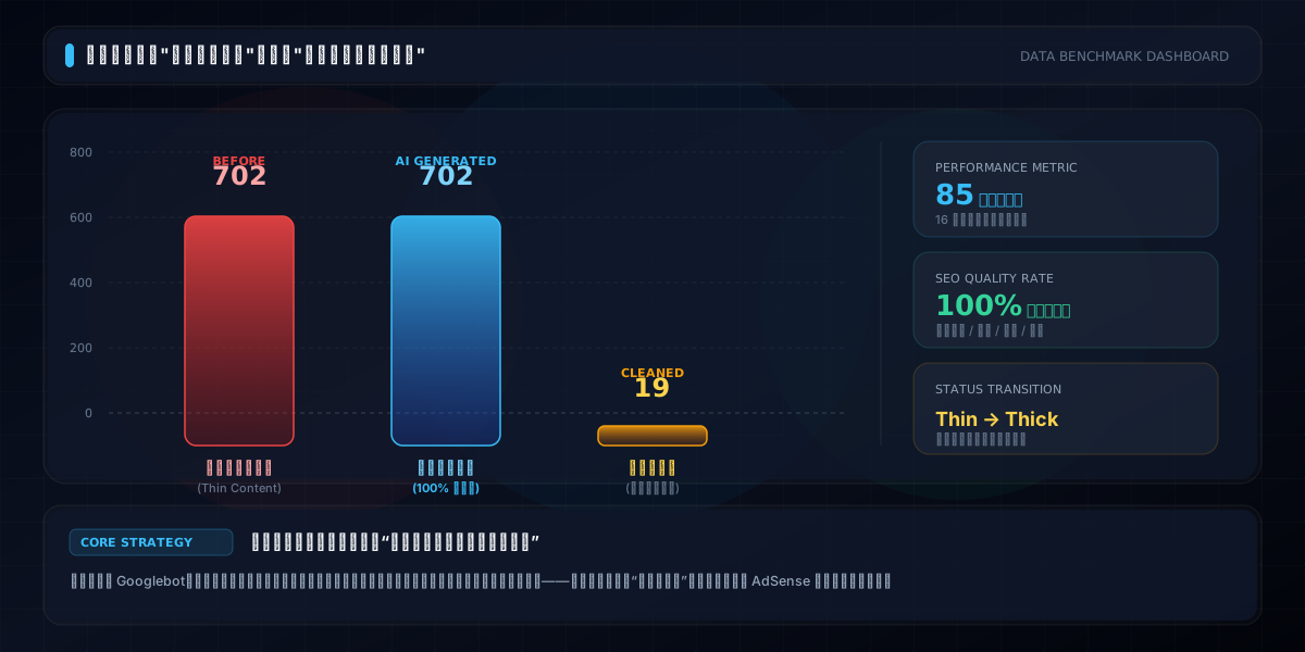
While adding descriptions, I also swept out the "junk images": nineteen with no dimensions at all, unknown what they were, deleted; plus a batch too small in size, nearly a quarter of public images, not deleted but put on the books. Adding up those numbers gave me a shock — the "good enough for now" spots pile up, and pile up into "low value."
But right after, I dug something worse out of the data.
A batch of images had a line in their description: "Images sourced from the internet; contact us for removal."
Looking back, that line was one of the dumbest mistakes I ever made. Its intent was "disclaimer," but written out, to anyone who knows, it's literally declaring "these images aren't mine to use." AdSense reviewers are exactly the people who look at this stuff most carefully. A website openly admitting "content sourced from the internet" — who would hang ads on that? That's the second layer of "low value," and the most fatal one: a trust problem, not a quality problem.
That night I removed that line from every image, then swept the whole site for any lingering disclaimer-style phrasing. After that, I spent two evenings straightening out copyright statements site-wide: the About page got an "Image Sources & Copyright" section, the privacy policy got "platform images come from free stock resources and user original uploads," and every detail page marked scraped images with "Image source: free stock resources." Lying in bed afterward, I thought: all of this should have been done from day one — not for the reviewer, but to cover your own back.
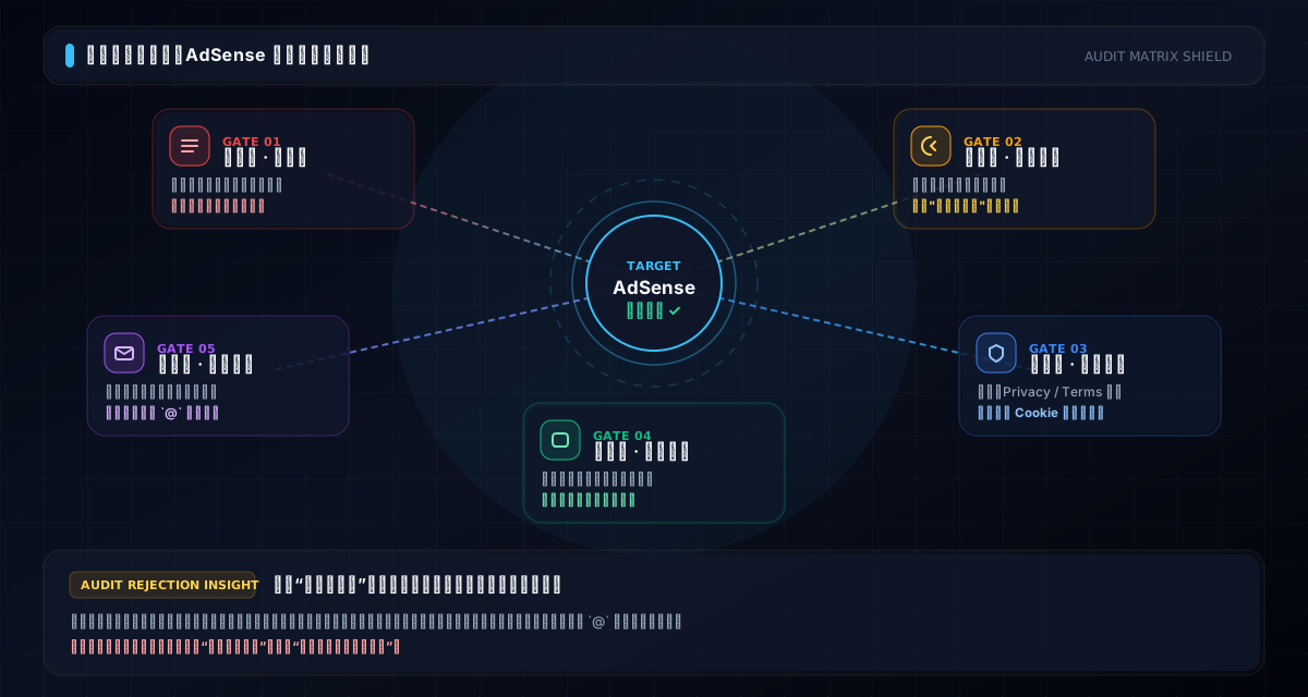
And here I realized: the fix was never just about images. That night I ran through the question "how would a reviewer see this site?" from top to bottom, and the more I thought, the clearer it got: whether a site passes isn't about any single image or page — it's about whether the whole site "looks like a real website."
So I started a systematic health check.
First, the legal stack. Privacy policy, terms of service, about page, community guidelines, editorial standards — five pages, opened one by one. Reading them made my heart sink: the privacy policy read like a grade-school essay, the about page had three lines, and worst of all, nowhere did they mention the word "advertising." You're applying for AdSense, yet your privacy policy never tells users "this site runs ads, and ad vendors may use cookies" — aren't you planting a landmine under yourself? I spent a full week rewriting all five pages: the privacy policy became thirteen sections covering what's collected, how it's used, how cookies are handled, who the ad vendors are; the terms spelled out user-upload copyright ownership and platform rights; the about page got the operator, contact info, and filing number; community guidelines and editorial standards were completed too, including complaint channels and DMCA takedown procedures. By the last page, I almost felt I wasn't writing legal documents — I was airing out years of experience and lessons learned.
Then cookies. AdSense requires handling user consent for advertising — it's mandatory. I hadn't built that at all; users just got cookies planted on arrival. After the fix, a banner appears on entry, asking whether you accept advertising-related cookies — no acceptance, no cookies; acceptance, cookies planted, with a dedicated management entry. It looks small, but it's something reviewers actively check: a site with no cookie consent is a site that never took compliance seriously.
Then mobile. I mostly use a desktop, so I'd never paid much attention to phones. Walking through on a phone this time, I couldn't keep a straight face: some pages scrolled sideways, clearly not adapted; bottom buttons crammed together, impossible to tap accurately; one page spun loading forever, slow as an ox pulling a cart. I spent two days fixing mobile adaptation, button spacing, and image loading. Then I walked through on my phone again — much smoother, and my heart settled a little.
And the SEO pile. A stock site lives on being found, but my check found: many pages had empty titles, bare browser tabs; some pages had no descriptions; the sitemap hadn't been updated, so search engines had no idea what pages existed. I reworked every page's title, description, and keywords, regenerated the sitemap, set up the zh/en version relationships (hreflang), and added share-card cover images for every article. None of this is glamorous, but it's the most grinding work of all — hundreds of pages, one by one; the titles alone took me two full days.
The i18n gate nearly broke me. I was editing the copyright statement. The Chinese version was fine; I switched to the English version — white screen. The whole page blank, console flooded with red errors. I stared for a long time, first blaming cache — refreshed, still white. Then blamed network — switched browsers, still white. Finally the error gave me the clue: vue-i18n, the i18n plugin, treats the @ in an email address as special syntax. "shengqiangwang666{'@'}gmail.com" was fine in Chinese; the moment it hit English, that @ made the entire language file fail to compile, and the page went white instantly.
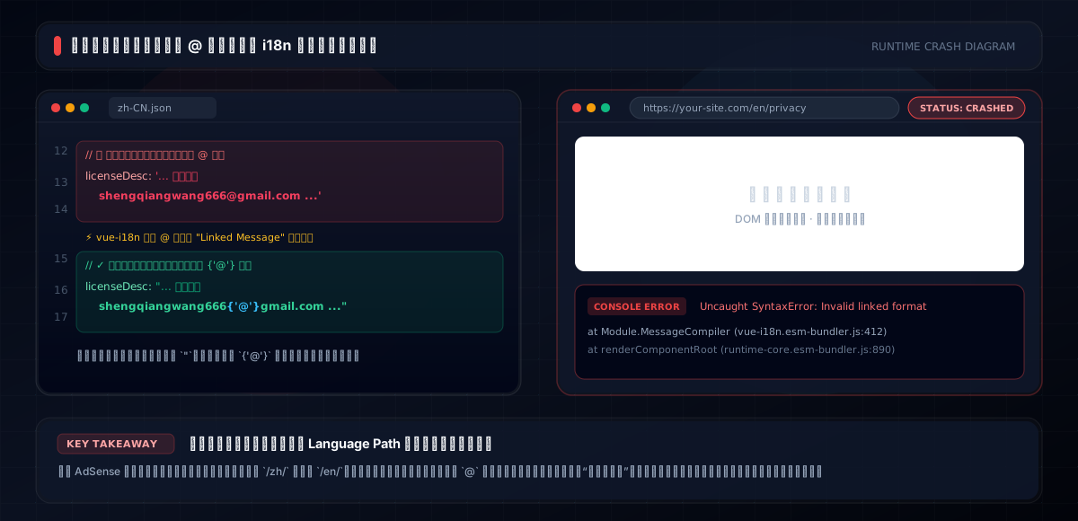
I felt a mix of anger and amusement. One email symbol, destroying a whole page. The fix was simple — escape the @ as special notation. But you never know about a trap until you step in it. Multilingual sites fear exactly this: you think the English version is just a translation, but each version has its own ways of dying. If the reviewer switches to English and sees white, they've already stamped a big X on you. That night I checked every language file, escaped every email address, then verified page by page across languages, cursing myself: why didn't you test the English version when you wrote these?

By then, I couldn't tell whether I was passing an audit or paying off debts.
Those weeks I was almost every night at the computer. Once, half-asleep, logs scrolling past, I half-dreamed the numbers were mocking me: seven hundred and two, nineteen, twenty-four percent... Actually, the whole fix boiled down to a handful of things: add descriptions, remove disclaimer lines, write legal pages, add cookie consent, fix mobile, patch SEO, repair i18n, delete junk images. But each one, I had to discover, act on, and verify myself. No book tells you "what exactly is wrong with your site."
Later, I had dinner with a friend who does cross-border e-commerce and mentioned it. He laughed and said their company rewrote the About page and Contact page three times before passing. I asked, seriously? He said, reviewers are people, not machines. A site that looks run with care, that feels reachable, versus a dead site not updated in three days — the first impression is completely different.
That stuck with me. AdSense review, in the end, is one person's "impression score" of your site. You can't make the reviewer see all four thousand images, but you can make sure that in the few minutes they spend, what they see is a "serious, complete, trustworthy" website. Every page they open tells them: this owner cares about his site.

The day I reapplied was a weekend.
I wasn't as confident as the first time; I was actually nervous. My hand trembled a little filling out the form. After submitting, I stared at "submitted" for a long time, my heart in my throat. During the wait, I rechecked every place I'd fixed, like a student checking answers before handing in the paper. Those days I developed a habit: checking the dashboard on my phone whenever I had a free second. A friend invited me to dinner; sitting at the table, chopsticks in hand, my mind was still on that "pending" page.
As I write this article, the result still hasn't come.
I've counted — since submitting, I've refreshed the dashboard dozens of times and checked the email hundreds. I'd be lying to say I'm not anxious. But oddly, this wait is different from the first. The first time, my head was full of "why not approve me?" This time, it's more calm — descriptions added, disclaimer lines removed, legal pages written, cookie consent added, mobile fixed, SEO patched, i18n verified. Everything doable is done. The rest is up to the reviewer.
Looking back on this half year, if I had to summarize, there are three lessons, all plain common sense.
But before that, one honest note: as I write this, my AdSense is still "under review," and I'd be lying to say I'm not nervous. Yet this half year of fixing changed how I feel about the site — it used to be my "shelf," now it's more like my "work." Even if it fails this time, I now know exactly where to put the effort. In the end, approval is the outcome; making the site good is the foundation.
First, treat the site as a work, not a shelf. Especially for a stock site. Images are the core, but the words around them — descriptions, categories, copyright statements, usage notes — are what make the site "alive." The reviewer can't see your passion; they can only see your pages. Clean, complete, with a clear story — that's what makes them trust the site.
Second, compliance isn't for the reviewer — it's to cover your own back. Copyright statements, source labels, privacy policies, cookie consent — these should exist before you ever get rejected. You never know when someone will complain; having statements, records, and contact channels is what lets you sleep. AdSense just moved up the "sooner or later" task. It's a mirror showing all the holes you were too lazy to patch — unwritten policies, unadapted layouts, missing content, untested pages.
Third, for multilingual sites, every version is an entrance. The Chinese version being fine doesn't mean anything if the English version white-screens. Change anything, verify both languages. Don't ask me how I know.
And one extra note: rejection is not the end of the world. Almost every site owner I know passed only after one or more rejections. Treat the first rejection as a free "site health report." The report only says "low value," but dig along it, and you'll always find holes you never expected — seven hundred description-less images, one "contact us for removal" line, one white-screening email symbol, or a privacy policy that never once mentioned ads.
Fill them in, and you're a little stronger than yesterday.
A little at a time. That's enough.
Note: This article is a personal ops note, not legal or ad-compliance advice. AdSense policies change; please defer to Google's official documentation.