
I once built a photo community. The home page is a waterfall; a single screen can hold dozens of images. In the earliest days after launch, I opened the home page — with a slightly slow connection, the page filled in square by square, not a white screen, but images popping in one by one like a slide show from an old projector.
After enough user complaints I started digging: why is this so slow?
The answer, you may not believe it: the home page was requesting 100+ images at once. Waterfall or not, images below the fold were being fetched too. To show 100 images, I had the backend send 100 URLs and the frontend loaded them all in one go. Result: the user stares at the first screen while the browser secretly downloads the tenth screen's images. Bandwidth wasted on images nobody looked at.
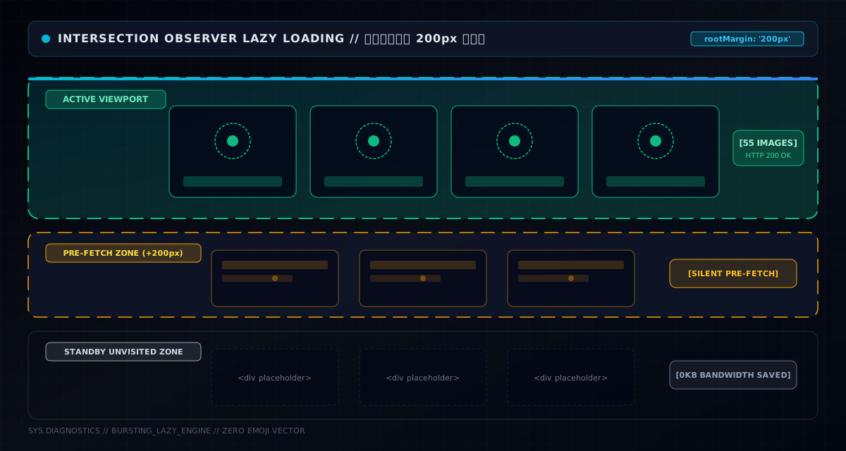
The idea is almost too plain: an image loads when it nears the viewport; before that, it's a placeholder. This project uses the native browser API IntersectionObserver — built precisely for "detect whether an element entered the viewport", far more efficient than listening to scroll (which fires per pixel; IntersectionObserver is browser-optimized and fires at a controlled rate).
The core is just a few lines:
const observer = new IntersectionObserver((entries) => {
  entries.forEach(entry => {
    if (entry.isIntersecting) {
      const pictureId = entry.target.getAttribute('data-pic-id')
      if (pictureId) {
        visiblePictures.value.add(pictureId)   // mark visible → render <img>
      }
    }
  })
}, {
  rootMargin: '200px'   // preload 200px ahead
})
Paired with conditional rendering in the template:
<div :data-pic-id="picture.id" v-if="visiblePictures.has(picture.id)">
  <img :src="picture.thumbnailUrl || picture.url" loading="lazy" />
</div>
The logic: the image's DOM initially doesn't render an <img> (just a placeholder container carrying data-pic-id). When IntersectionObserver reports it has entered the viewport (or the 200px preload zone below), the picture id is added to the visiblePictures Set, and Vue reactively renders the real <img> — that's when the browser actually requests it.
The key: Vue's reactivity does the heavy lifting here — visiblePictures is a ref<Set>; add an id and every component depending on it re-renders. The whole "placeholder → real image" transition needs zero manual DOM manipulation — data-driven, clean.
Principles aren't enough; I ran a headless browser against the live home page and measured. Method: open the home page, count all image requests the browser makes, in two phases:
The result:
First-screen image requests: 55
After scrolling: 93
Lazy-loaded on demand: +38
What this means: the page has 93 images total, and the first screen only requested 55 — the other 38 were "visited" as the user scrolled. Without lazy loading, the first screen would fire 93 requests at once — bandwidth, connections and backend pressure all double. With lazy loading, the first screen is 55 requests; the rest arrive on demand.
This is measured data from a real site, not lab numbers. Screenshots below — the first is the first screen (no scroll), the second is the full waterfall after scrolling to the bottom:


Look closely at the first screenshot: some images near the bottom half are still "placeholder state" — they're right at the viewport edge, either not yet marked by IntersectionObserver or just at the rootMargin boundary. That's lazy loading in real time: not everything appears at once — it lights up as you scroll.
The experience detail here: if you load strictly on viewport entry, fast scrolls show images "not loaded yet" — you scroll to one, it starts downloading, with a white flicker. So rootMargin: '200px' extends the "viewport" 200px downward: an image not yet in view, but within 200px of it, starts loading. By the time the user scrolls there, it's already downloaded.
That 200px was tuned: too big (500px+) means downloading too much early, gutting the lazy benefit; too small (50px) means white flickers on fast scrolls. 200px balances "imperceptible preload" against "true on-demand". Mobile networks are slower, so the 200px head start matters even more — by the time a finger scrolls over, the image is in transit or already there.
Lazy loading solves "when to download"; thumbnails solve "how much to download". A 5000×3750 original photo is 8MB; if the waterfall list loaded originals, 55 first-screen images = 440MB. Who can afford that.
So after upload, COS (object storage) generates a derived image:
// thumbnail rule: max 1024px + WebP format
String rule = String.format(
  "imageMogr2/thumbnail/1024x1024>/format/webp/quality/%d", quality);
imageMogr2 is Tencent COS's image processing interface: thumbnail/1024x1024> shrinks to within 1024px (> means "shrink only, never enlarge"), format/webp converts to WebP, quality controls quality. The result is stored in COS, a thumbnail URL written to the thumbnailUrl field.
The frontend list loads only thumbnails:
<img :src="picture.thumbnailUrl || picture.url" ... />
Thumbnail if present, original as fallback. 8MB → 128KB, 98% smaller, and visually the list is indistinguishable (1024px is sharp enough on phones and regular desktops). The detail page loads the original — by then the user has decided to look, so 8MB is worth it.
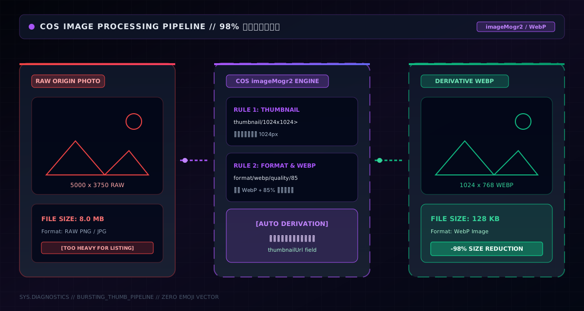
This "lazy + thumbnail" combo took the first screen from "100+ originals at once" to "55 × 128KB WebPs arriving on demand" — a two-orders-of-magnitude cut in first-screen bytes.
Lazy loading handles performance; the waterfall handles aesthetics. Grids (equal height and width) have a problem for photo communities: aspect ratios vary wildly, and cramming them into equal-height cells either crops the subject or leaves ugly whitespace. The waterfall (Pinterest-style) idea: columns equal width, images unequal height, and each new image goes into the currently shortest column.
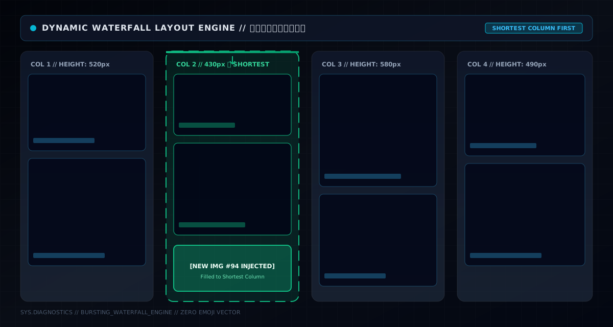
In practice, the PC side uses a multi-column waterfall (BigPictureList distributes by column); mobile has its own set (MobilePictureList, two or single column). Since images differ in height, columns naturally end up uneven; new images fill the shortest column, keeping the overall height difference minimal — maximum visual density, no jarring gaps.
Waterfall and lazy loading are natural partners: waterfall images have dynamic heights — you only know the height once the image loads — and lazy loading guarantees only visible images load, so the two fit perfectly. Load everything in a waterfall and both layout and performance collapse together.
Three pits worth sharing from this system:
First, the observer's timing. Data arrives asynchronously; the image DOM renders only after data lands. If you observe once in onMounted, images rendered later are never watched — placeholders forever. The fix: re-observe after data updates (the code's observeImages() runs after data arrives, querying all again). This one is insidious: the first screen looks fine, then paging reveals new images never load, and you suspect the API is broken.
Second, rootMargin isn't a bigger-is-better knob. I started at 500px, thinking more preloading couldn't hurt. First-screen requests doubled — lazy loading became theater; preloaded images may never be scrolled to. I settled on 200px. Preload for images "about to be seen", not "might be seen".
Third, thumbnail fallback. Legacy data (uploaded before the thumbnail feature) has no thumbnailUrl; the list loads picture.url directly — an 8MB image, instant jank. So the frontend must use thumbnailUrl || url, and the backend runs a batch job to backfill thumbnails for old images. Old/new data incompatibility is the reality of every incremental feature.
The lesson I want to end on: the worst thing in performance work is "I feel like". I felt lazy loading would help — by how much? I didn't know. Not until a headless browser counted the requests: 55 → 93, 38 loaded on demand, first-screen requests halved. With numbers on the table, optimization goes from "feeling" to "fact".
If you're building an image-heavy site, this "IntersectionObserver lazy loading + rootMargin preload + COS thumbnails + waterfall" is the standard answer — copy it directly. Three things to remember when you do: re-observe after data updates (or new images never load), keep rootMargin around 200px (don't be greedy), and load only thumbnails in lists, leave originals for the detail page (two orders of magnitude smaller).
And one more: measure with a headless browser — record request counts, bytes and load times. Not for the blog. It's for the next time someone questions "is this optimization even worth it?", so you can throw down a dataset instead of a "feels faster to me".