
Some words only come out when no one else is watching.
It was summer when I built this page. I was working late into the night, the skewer stand downstairs had already packed up, and across the street a single streetlamp was left shining on an empty road. I clicked through the old articles on the site one by one — the copyright one, the animation one, a few technical notes hiding in the corners. They were scattered like a study no one had tidied, dust on the spines, readers finding whatever they happened to find. And I suddenly thought: maybe they deserve a proper bookshelf.
That night I thought a lot. Why this site exists. The people still flipping through pictures at two in the morning. Eventually I wrote one line on a sticky note: don't build this page for the search engines — build it for the people who genuinely want to stop and read for a while.
Thoughts are light when they arrive and heavy when they land. For the next two weeks, almost everything I did went into this page.
The next day I opened Figma, ready to do big things. Then I stared at the blank canvas for about ten minutes and drew absolutely nothing.
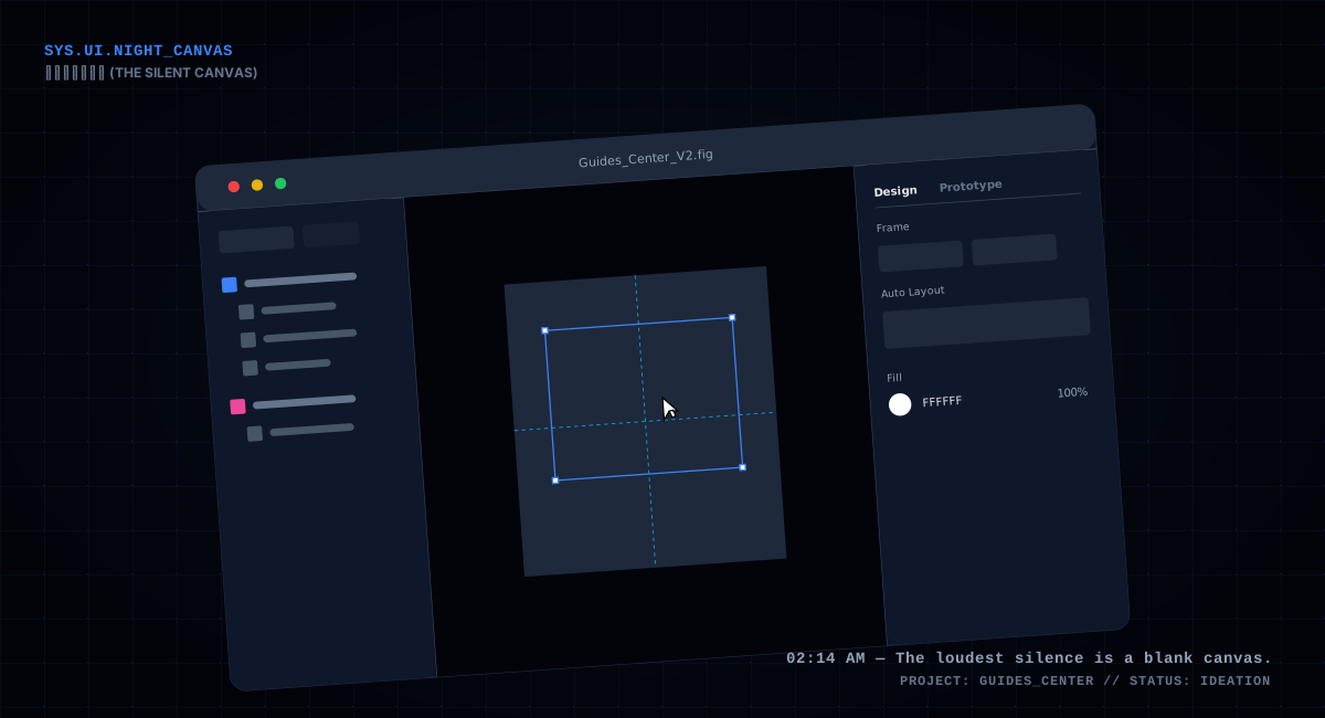
▲ Rolling my eyes at a blank canvas for three minutes — not that I didn't want to draw, I just had no idea where to start
Design is never hard because of the hands. It's hard because you don't know where to move. A blank canvas is terrifying — you have a hundred directions in your head, and every one of them looks like the destination, so you're afraid to take the first step.
In those ten minutes my head wasn't empty — it was loud. A voice on the left said: keep it simple, copy the big companies. A voice on the right said: we're a small site, we need our own flavor. And a voice in the middle kept urging: don't bother, just use a template, nobody looks that closely anyway. I stared at the white, and suddenly understood what was actually blocking me. It wasn't that I didn't know how to design. It was that I hadn't decided who this page was for.
"Who it's for" — those three words matter more than any color palette. Figure that out, and half the answers show up on their own.
Then I realized something else: design doesn't start with pixels, it starts with an idea. An idea, once it lands on paper, becomes a few words. The words I gave this page were few:
I can't help going on a bit about rounded corners. Old-school web pages loved right angles — crisp and clean, a habit inherited from print. But a screen isn't paper. The text and blocks on a screen are made of glowing points of light, and right angles sit there stiffly in that medium, like two strangers who refuse to look each other in the eye. Rounded corners aren't cute — they're humble. They make people willing to look twice. The products that feel "premium" these days, once you boil them down, are just a few things done well: rounded corners, whitespace, one consistent easing curve, and restrained color.
Those words later became my ruler. Whenever I couldn't decide whether to keep something, I measured it against the ruler, and more often than not the answer floated up by itself. A ruler is something you barely use day to day — but at the moment of decision, it's the only thing that keeps you from regretting. You might think I'm making a fuss over a small page. But it's precisely these unmanaged little pages that grow into a stew of features. Without a ruler, you'll want to keep everything.
After the words came a feature list — the kind you write for yourself, like a memo: a header that tells people in three seconds what this place is; filters to sort articles by copyright, design, performance, and frontend; article cards; and on the detail page, the things that can't be left out — a table of contents, code copy, tables, formulas; and at the bottom, previous and next article, plus a copyright notice.
The relationship between features and design, put plainly, is a matter of order. If you polish pixels before the features are settled, you've done the most wasted work there is — I've seen plenty of people draw a stunning login page first, then discover the business never needed it. All that excitement for nothing.
While writing the list I had a trick: every feature had to answer "what reader problem does this solve?" If it couldn't, I'd jot it down anyway rather than delete it — but mentally mark it as pending. When I looked back at the end, most of the pending ones had been crossed off.
A real example: I really wanted a "word cloud" on this page — pile the high-frequency words from the articles into a colorful cloud with a floating animation. It was beautiful, so beautiful I already knew where I'd put it. But measured against the ruler — motion with restraint, content first — it matched neither. A word cloud is decoration, not navigation; no reader ever finds anything through it. I crossed it off the list with real reluctance. After the page went live, nobody noticed it was missing. See? The things you think matter — readers never knew they existed.
 ▲ Two weeks later, this page had grown into this — one line on a sticky note finally had a place to land
This next step may sound a little unprofessional: I let the AI draft it for me.
That night I sat at the chat window and translated the keywords into words it could understand — mobile-first, rounded cards, glassmorphism, cool tones, whitespace. It was quick; within seconds it handed me several versions.
The first glance was stunning. The compositions were nice, the palettes comfortable, and at a glance they looked like a proper knowledge base. I felt a little thrill: got it.
Then I zoomed in. Spacing was off. Chinese text was all gibberish. Icons were scattered everywhere, like someone drunk had knocked over a table. In one instant I fell from the top of the mountain to the bottom, angry enough to almost close the window.
▲ Zooming in on the AI draft — spacing all over the place, Chinese text turned to gibberish. Facepalm.
But anger aside, once I calmed down I stared at them for a long time. An AI-drawn picture is a lot like a dream — however vivid the scene is while you're in it, it falls apart when you wake up. And yet it can still tell you, roughly, what the thing you wanted looks like. "Hero with words on the left, a few translucent plates floating on the right" — that direction came out of one of those dreams. Later, in Figma, I drew by the shape of that idea, not by copying the image.
One small detail: it has no natural sense of whitespace. When you ask it to design, it stuffs every inch full; you have to keep saying "emptier, emptier," until it finally agrees to leave one clean corner. That process reminded me of learning calligraphy as a child — my teacher made me leave margins at the top and bottom, said the character must sit in the center of the grid with space around it. I didn't understand then. Later I understood: whitespace isn't waste. It's what lets the things that deserve to be seen actually be seen.
It only dreams. I'm the one who draws once it wakes up. I kept that sentence for a long time.
Later I asked it for another round, feeding it the direction I liked and asking it to go deeper. What it returned still couldn't be used directly, but some fragments — the proportion of a certain card, the rhythm of a certain gap — were suddenly right. I was like someone picking stones on a beach, pulling a few usable ones out of its pile of half-finished work, then laying them into my own wall one by one.
Later a colleague asked me whether AI can just hand you a finished design. I said it can — but only if you already know what you want. It won't decide for you; it only imagines for you. When you don't know your direction, all it gives you is a pile of pretty scrap paper.
In Figma I turned the dream into a proper drawing. "Drawing" is a generous word — it was a thin layer, nothing mystical:
A "design system" sounds enormous, but at the bottom of it all it's just a table plus one discipline — when writing code, never hard-code a color; always pull from the variables. The table looks roughly like this:
| Variable | Light | Dark |
|---|---|---|
| --background | #ffffff | #1a1a1a |
| --text-primary | #3e3f3f | #ffffff |
| --text-secondary | #666666 | #b3b3b3 |
| --border-color | rgba(200,190,180,0.22) | rgba(255,255,255,0.1) |
| --card-background | #ffffff | #2d2d2d |
And so every color on this page wears the face of var(--xxx). When dark mode needs to change, add one class to the html, swap the whole variable set, and the page follows — not a single line of component code moves. That might be the best decision I made on this page. Color is the hardest thing to keep restrained. One pen, two inks, and the writing looks cleaner for it; add too many colors and the page starts shouting.
The place where rounded corners really earn their keep is that row of filter pills and the article cards. The pills are fully rounded; the selected one inverts — its background becomes the text color, its text becomes the background, spotless. The cards wear 24px corners, and on hover they lift three pixels, their shadow loosening. All tiny styles you could describe in a single sentence, but put together they give the whole page that "modern" dignity. Don't underestimate that word, dignity. People decide in the first glance whether a place takes itself seriously.
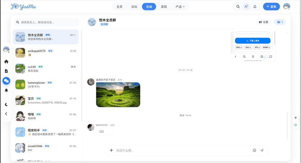 ▲ The filter pills and article cards — where "rounded modern" lives on the page day to day
And here I have to be honest: everything looks good in Figma, because you don't have to worry about the content actually being 1200px wide, or about dark mode, or about how long a real article title can get. A design file is always prettier than the implementation — that's the industry's eternal truth. So my rule became: Figma gets the direction right, pixels get fine-tuned in the browser, and never die fighting inside Figma — that's a time black hole.
Even so, when the first version was written, I still stared at the screen for a while — the pills that looked so graceful in Figma turned fat and cramped in the browser; long titles made the cards wrap, like clothes in the wrong size. A design file is tailored for perfect content, and real content never dresses nicely. From that day I understood: frontend work is half drawing, half tailoring the drawing for real material.
The night I tuned dark mode, I switched off the main light, dimmed the screen to its lowest, and looked at it for a long time. On the dark page, the rounded cards floated like a row of small windows in the night, each glowing its own square of light. Hard to describe — like opening a quiet place late at night and being willing to stay a little longer.
With the drawing done, the real trouble began — turning the drawing into code.
The three glass plates in the Hero were three pretty color blocks in Figma. In the browser, they had to learn to float. Three absolutely-positioned divs, a perspective camera on the parent, all three plates sharing the same rotation and only separated by distance, with backdrop-filter polishing the glass texture:
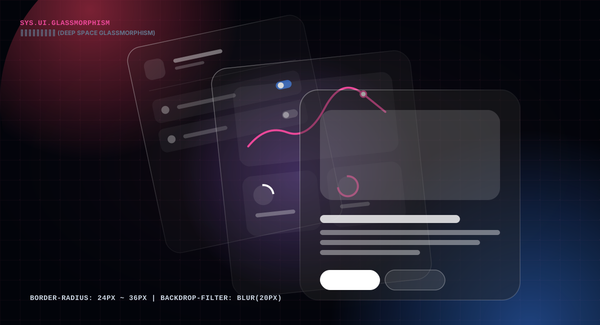
.glass-plate {
  position: absolute;
  width: 170px;
  height: 215px;
  border-radius: 22px;
  backdrop-filter: blur(20px) saturate(190%);
  -webkit-backdrop-filter: blur(20px) saturate(190%);
  transform-style: preserve-3d;
  transition: all 0.4s cubic-bezier(0.16, 1, 0.3, 1);
}
That one block of CSS took me an entire afternoon. Safari didn't recognize the prefixless backdrop-filter — fine, add the -webkit- prefix. Then it complained the filter did nothing without a background — fine, pad a semi-transparent gradient underneath. When it finally looked "glassy" on desktop too, I got excited and tested it on a low-end Android — dropped frames, smearing, dragging like mud.
▲ Safari wants the prefix, Chrome says there's no background, Android says it's too heavy — one filter, three browsers, and me scrambling
That was the first time I wanted to delete it.
But it was the first thing I fell for, and I couldn't bear to remove it. Before deleting, I lifted it out on its own, confirmed on desktop that it was beautiful, confirmed on mobile that it was in the way. Then I remembered my ruler: mobile first.
So in that media query, one unassuming line appeared: display: none. The glass plates now only show on wide screens; on phones, the page is clean, without a single extra ornament.
Some things aren't bad — they're just in the wrong place. Understanding that is harder than knowing how to write backdrop-filter.
Looking back at the accounting, I spent an afternoon plus an evening on these three glass plates. As a return on investment it's a catastrophic loss. But some accounts can't be tallied that way — when you've truly sweated over something, the feel for it, the instinct, quietly grows into other things. That's the other meaning of sharpening a knife.
To this day, honestly, I couldn't tell you what those three plates are for. They don't navigate, they don't carry information; they're pure decoration. But I keep feeling that a knowledge base needs a little "face" — something that makes a first-time visitor think: this is a place that takes itself seriously. The line between decoration and noise is exactly here — it makes you feel the place is cared for, not distracted.
The detail page's story starts at a very specific moment.
That day I was reading one of my own long articles on my phone. Two-thirds in, I wanted to go back to a sentence near the beginning. There was no table of contents, so I could only inch upward, overshoot, and inch back down. The screen stayed lit as my thumb slid up and down in vain, and suddenly I was annoyed.
▲ Two-thirds through, trying to find one sentence from the start, sliding back and forth and failing
A long article without a table of contents is an act of betrayal against the reader. I decided to fix it.
The desktop was easy — a fixed table of contents on the left, every heading in the article getting a line, the current section highlighted as you scroll. The highlight isn't magic; it's a scroll listener that walks backward to find "the first heading that has already scrolled past the top":
const handleScroll = () => {
  const scrollPosition = window.pageYOffset + 120
  for (let i = headings.length - 1; i >= 0; i--) {
    const el = headings[i]
    if (el.offsetTop <= scrollPosition) {
      activeTocId.value = el.id
      break
    }
  }
}
The table of contents isn't hand-written — it grows out of the body text. While parsing, every h2 and h3 is recorded, arranged in order into the TOC, and each heading is given an incrementing id for anchor jumps. That way the TOC can never fall out of sync with the article — they're two faces of the same thing.
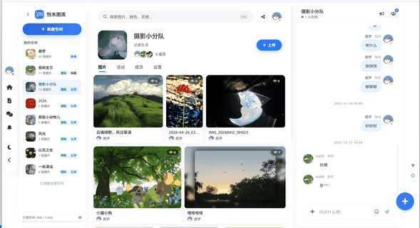 ▲ The detail page's smart TOC — fixed on the left, highlighting as you scroll
The phone was the real puzzle. The screen is only so wide; there's no room for a sidebar. I tried stuffing it at the top. I tried a popup that jumped out from the middle. Neither felt right. A popup is an interruption — you're in the middle of a book, a box jumps out and makes you put the book down to deal with it first. The gesture itself wounds the reading mood.
A drawer is different. A drawer slides out from the edge of the screen — it understands you're still reading, that you just want a quick peek at the contents and then put it away. It doesn't interrupt; it just hands you something at your side. That 0.25-second slide, from -100% to 0, settled a reader who wanted a way back:
@keyframes slideInLeft {
  from { transform: translateX(-100%); }
  to   { transform: translateX(0); }
}
Tapping the mask closes it; tapping inside the panel doesn't; tapping a TOC item jumps and closes it automatically. I used no library for this — one transform, one easing, that's all.
▲ The moment the drawer slid in from the edge — not "pretty," but "right"
Mobile isn't a shrunk-down desktop. I'd written that sentence countless times without knowing what it meant — until this drawer was done, and I finally got it.
 ▲ The mobile TOC drawer — slides out from the edge, closes itself after you pick
The days I spent on the drawer, I kept thinking of going to bookstores as a kid. The top shelves were out of reach, so you'd fetch a stool. Nobody praises the stool, nobody even notices it — but without it, that book stays forever out of reach. The table of contents is, to a reader, that stool. Great design amounts to making the stool a little easier to find and a little easier to put down.
The day it was done, I screenshotted it and sent it to a product friend, asking how it felt. He answered with four words: "Looks like the real thing." I was happy about those four words all night — when a picky person who has seen a thousand products says "looks like the real thing," it means more than "very pretty."
The footer also holds two quiet things: previous and next article, and a copyright notice. The previous/next link is a path for the reader — finish one, follow the hand and keep walking. The copyright notice is a reassurance — who wrote this, whether it can be used, and how, all laid out in the open. A page feels steady because of the dignity hidden in its corners.
Further down the detail page is how the body text gets rendered. I tripped over more here than anywhere else, and it's the least flattering part.
At first I tried to be lazy and use an existing markdown library. But the articles on this site aren't just markdown — there are formulas, tables, interactive demo blocks, and a pile of animated GIFs. Either I tore the library apart and rebuilt it, or I wrote my own. I chose the latter and stepped right into a bottomless pit. Actually, I did try the ready-made libraries first — bytemd, markdown-it, I installed them all. I gave up halfway through configuring — formulas needed a pile of plugins, the table styles had to be rewritten, and demo blocks were simply out of the question. Rewriting someone else's library is like renovating in someone else's study: the walls are yours, but the pillars aren't, and you'll forever be walking around them.
The editor here can even write formulas, and articles embed interactive demo blocks that have to be demonstrated live. The renderer reserves a place for each — formulas get a serif face and sit centered; demo blocks embed a real, clickable thing inside the body. The passage you're reading right now is running a demo like that underneath.
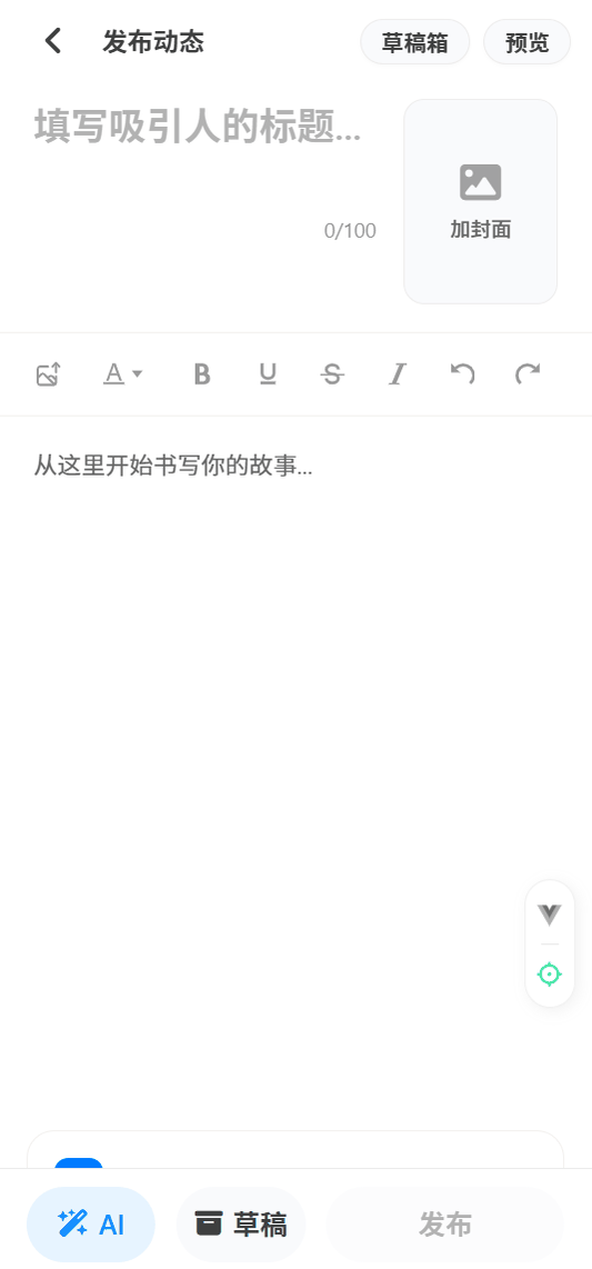 ▲ A live demo block embedded in the body — the kind you can click and try right there
Ready-made libraries can't give you any of this; you piece it all together yourself. The skeleton of the whole renderer is: pull the code blocks out of the source first, cut the remaining text into blocks by blank lines, then send each block to its own home by its shape — a line starting with hashes is a heading, a dash is a list item, an exclamation point and brackets is an image. Once sorted, lay them in order into the template, and an article is done.
The parser itself wasn't the hard part; the bits and pieces were: table separator lines, lists with stray paragraphs mixed in, headings with emoji in them — each one more finicky than the last. The worst part: the article content lives in a template string inside the code, and within it the code blocks need their backticks escaped, and interpolation symbols have to be dodged or they get treated as variable substitution. Miss one, and the whole file won't compile.
At two in the morning, staring at a red error line, I had exactly one thought: writing documentation is harder than writing code. Consider me converted.
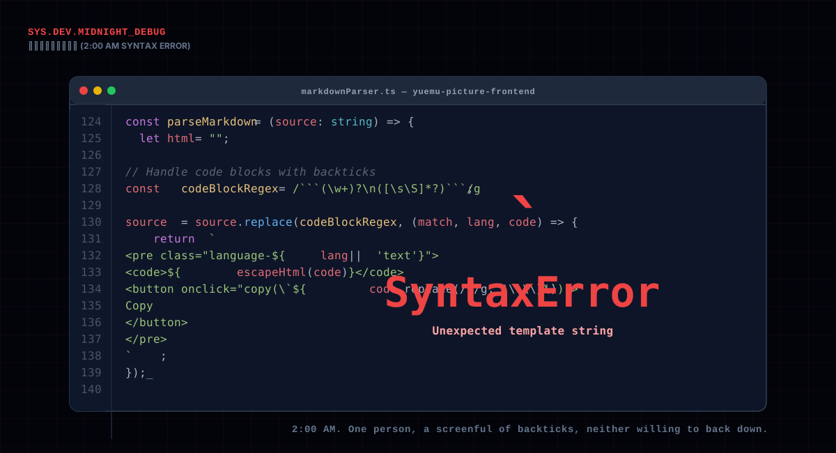
▲ 2 a.m., one person and a screenful of backticks, neither willing to back down
Later I added a copy button to every code block — click, "Copy" becomes "Copied," and two seconds later it flips back. When that little feature was done, I suddenly felt the earlier pits were all worth it — by giving the reader a copy key, you're telling them: this code, you may take and use. No matter how beautiful the design, it can't beat this small, practical button.
▲ The moment the copy button was done and actually copied when clicked — the satisfaction was real
The downside of writing your own parser is all the edge cases; the upside is you can add whatever you want, whenever. Lately I've become more convinced: for tools on the critical path, hold them yourself if you can — hand someone else the keys to the door, and every time they upgrade, you chase them, and what runs out in the end is your patience.
Later I glanced at the analytics. The copy button was clicked more than the share buttons at the bottom of the article. I was genuinely pleased — it means readers actually want to use this code, not just look at it and leave.
Motion, I thought about for a long time, and finally settled on one very plain principle: only move what should move.
Hover lift, arrow slide, drawer slide-out, pill inversion — every movement happens because a state changed and needed an account of itself. Nothing else moves. No particle explosions, no parallax scrolling, no whooshing full-page transitions. It's not that those can't be done — it's that once done, they steal the show from the content. You're in the middle of reading, and fireworks go off beside you; you'll think the site is flashy, but you won't think it's good.
Take the drawer: 0.25 seconds. Any slower and you feel the "drag"; any faster and the eye can't keep up and it blurs. Card hover: 0.25 seconds. Glass plates: 0.4 — they're bigger, heavier, give them a little more time. Motion is a thing where a few dozen milliseconds changes the whole feel — you may not be able to say it, but your body knows.
I set durations as a rule: everything between 200 and 500 milliseconds, and almost the whole site shares one curve. Looking back now, this "one temperament" of motion does more to make the site feel smooth than any flourish. You can hardly say where the smoothness is, but it's there. Like someone speaking — the same cadence in every sentence, and the longer you listen, the calmer you feel. If every sentence changed to a strange new accent, you wouldn't last through the content no matter how much you liked it.
Almost the whole site shares one curve for entrances — cubic-bezier(0.16, 1, 0.3, 1), quick start, gentle stop — and a matching pair for round trips. Some say motion should be rich, a different curve per state. I disagree. Richness is for the eyes; consistency is for the body. The body wants steadiness, not surprises.
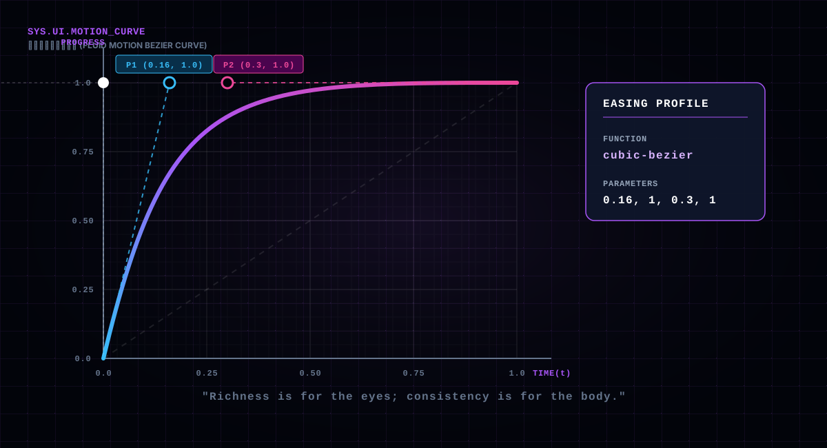
One detail I did but told no one about: the page respects the system's "reduce motion" setting — people who turn it on get all animations stripped away, leaving only instant state changes. Not every reader needs it, but someone always does. Accessibility work is often not a bonus point — it's the baseline.
By the way — by now you've bumped into one of this site's little secrets: the detail pages embed demo blocks you can actually click. Like the View Transitions below — switch between grid and list, and the browser does a native snapshot transition, without a single library:
:::demo view-transitions :::
When motion comes down to it, it's often like this: the more you want to be flashy, the more you reach for plain, boring techniques; the more you want modern, the more you lean on the things the browser already gave you.
The day the page was finished, I went in and out of it on my phone several times, and flipped through it in dark mode.
▲ Looking at it again in the dark — settled, like handing in a finished exam
Then I turned off the light.
The screen was still glowing. The three glass plates let faint light through against the dark background; the cards stood in a row, their corners round, quiet, like a neat line of spines on a shelf. I suddenly remembered the night I started — the skewer stand closed, me frowning at a floor of scattered old articles. Two weeks, one page. It isn't big, isn't even complex.
But I know every corner was rounded by hand, every millisecond was measured, and behind every line of code there is a late night. The people who use it probably can't say it — but the ones who read it will feel it. Like Zhu Ziqing's father climbing over the platform in "The Back View" — just a few steps, really, but those steps were walked slowly, slowly enough for a person to remember for years.
A page, while you're making it, weighs a thousand pounds. Finished, it's just a thousand lines of code and a few images. But it stands on the internet; someone clicks in during the day, someone clicks in at night — like a lamp that never goes out. The maker goes off shift; the reader is still on the road.
Then one morning I opened the analytics and saw that someone had bookmarked this guide. I don't know who they are, of course — but in that instant I felt all those late nights were worth it. The thing a maker fears most isn't the hard work; it's finishing and having no one see it. And being bookmarked is the best kind of being seen.
I don't know who clicked in first, or whether they liked it. I only know that in the two weeks of making this page, I put in everything I could think of, everything I could do. The rest, I leave to whoever reads it.